i’ve stopped trash talking comic sans after learning the font is actually one of the only dyslexia-friendly fonts that come standard with most computers and i advocate for others doing the same
In the event that you would like to continue hating Comic Sans, other dyslexia-friendly alternatives include Arial, Verdana, Tahoma, Century Gothic and Trebuchet.
thank
Random fact: Verdana is one of the few fonts which was specifically designed to be as easy to read as possible, even at smaller type sizes. It was designed this way for use on screen, but the same principles apply in print too. This is part of why some Universities use Verdana as their default font for documents.
“In the event that you would like to continue hating Comic Sans” is one of the best things I’ve ever read on this website
Century Gothic and Trebuchet are both quite handsome typefaces.
I’m partial to Century Gothic as well. It’s serif, but not boring.
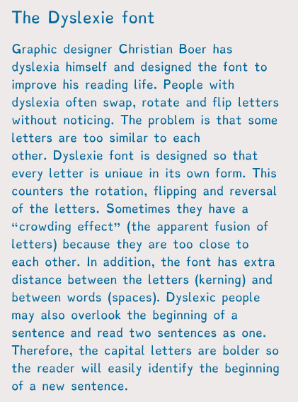
There’s also a dyslexic font designed especially for dyslexic people to read.
You can install on your tablets, laptops and browers etc, so not only can you change things like documents into it, you can change websites into that font as well!
I’m sure you’re bright enough to do a google search, but since I’m dumb enough to forget to post a link, here it is. Better late than never